Lilly medical information
A responsive website and pattern library for a leading pharmaceutical company.
User Research & Interaction Design
A responsive website and pattern library for a leading pharmaceutical company.
User Research & Interaction Design
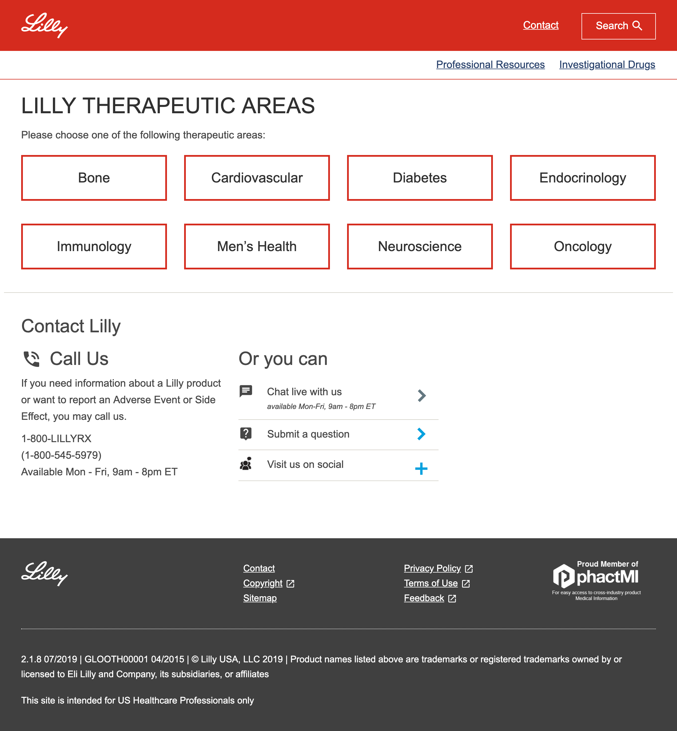
During my time at Foolproof, I was part of a team tasked with rethinking how information about Eli Lilly products was provided to US medical professionals.
Eli Lilly is an American pharmaceutical company whose products are sold in approximately 125 countries around the world. They wanted to make sure that information about their products were presented in a way that would ensure medical professionals were properly informed.
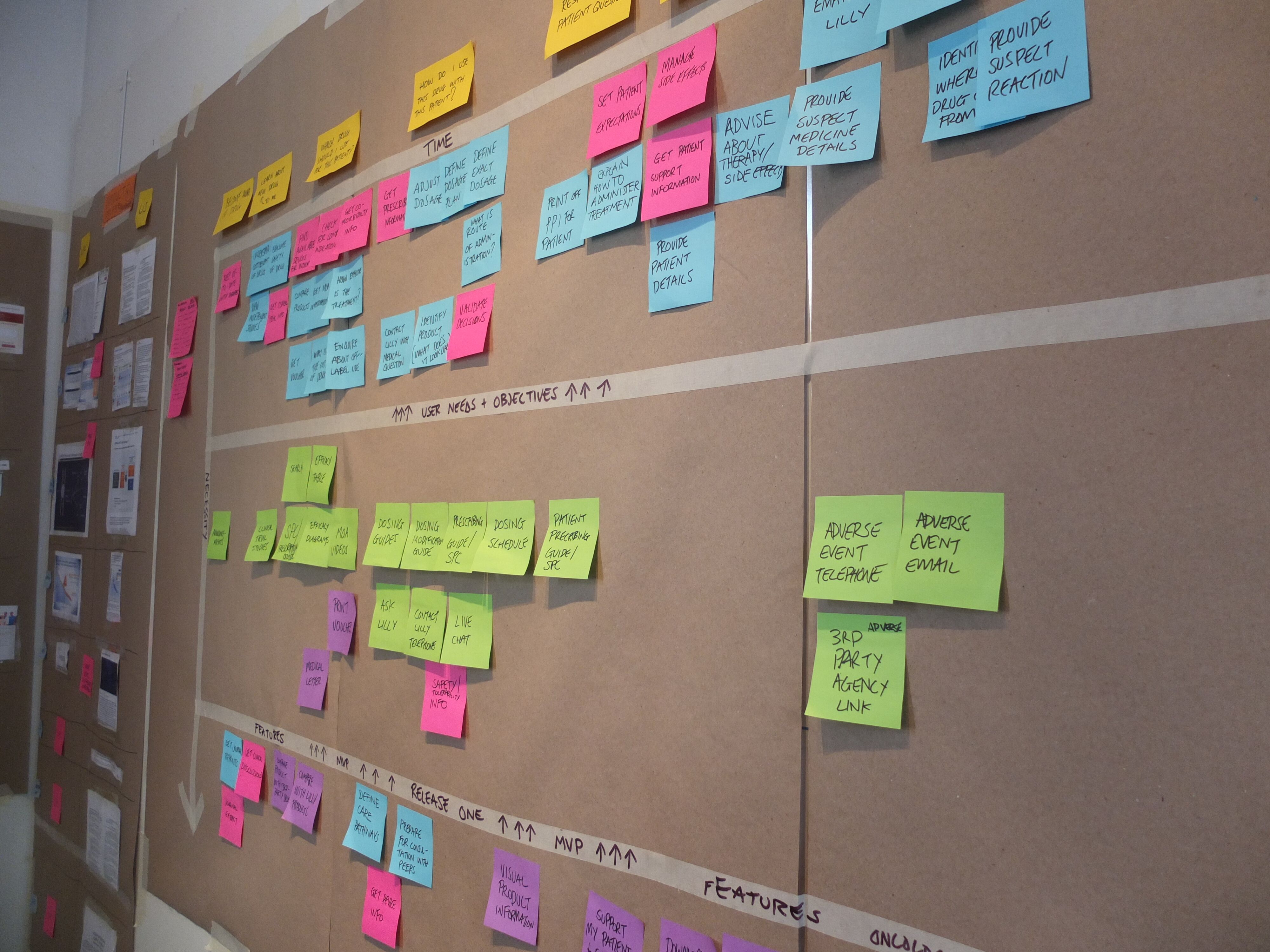
A user storymap for the site.
We spent a lot of time sketching, prototyping and testing with medical professionals. We found more than anything that our solution had to get out of the way so that users could find the information they were looking for and felt confident that they were properly informed.
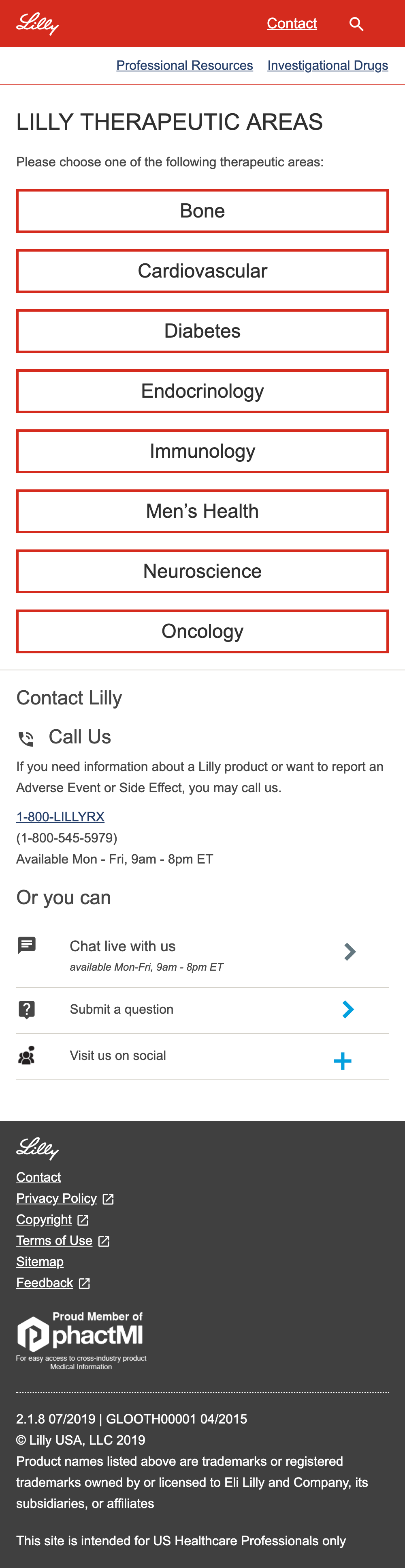
We created a simple design that allowed users to easily navigate through complex medical information on mobile and desktop.
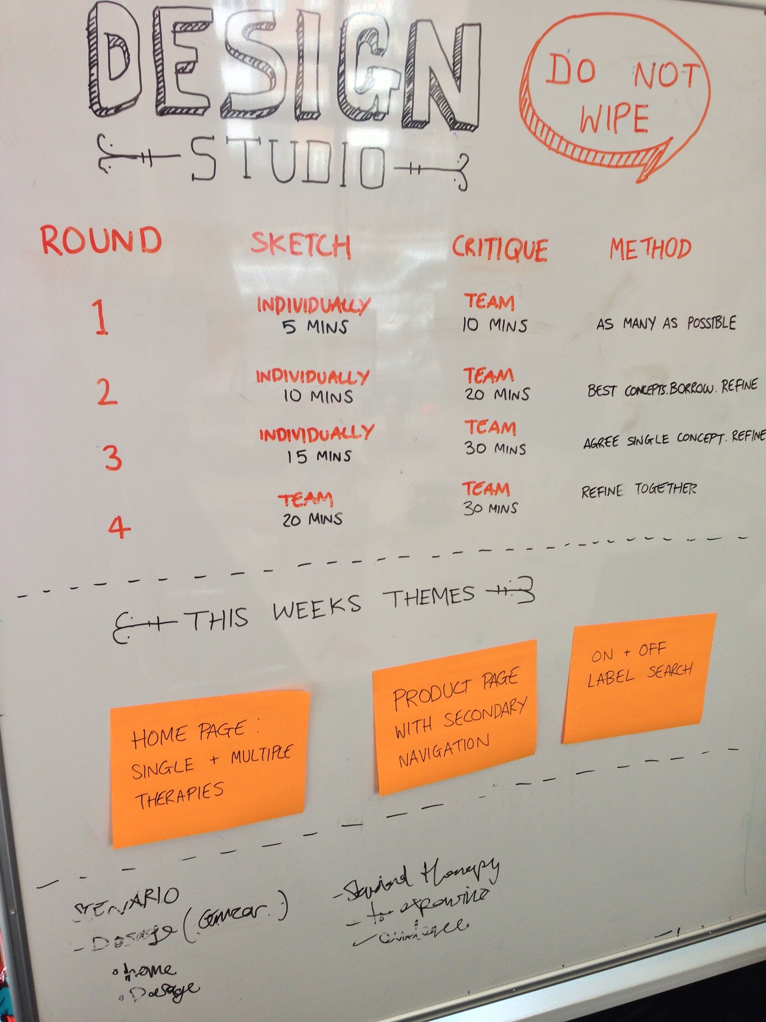
Design studio session agenda.
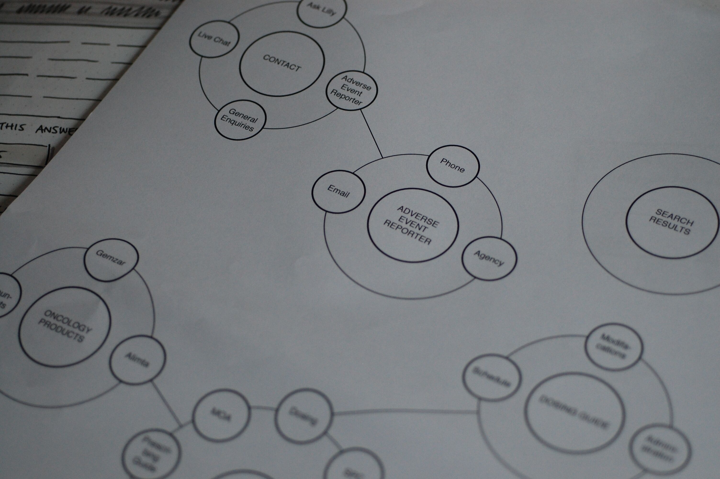
Information architecture diagram for the site.
I conducted user research with medical professionals, creating the information architecture, designing a responsive multi faceted search and working with the front-end developer on the team to deliver a design library based on atomic design methodology.
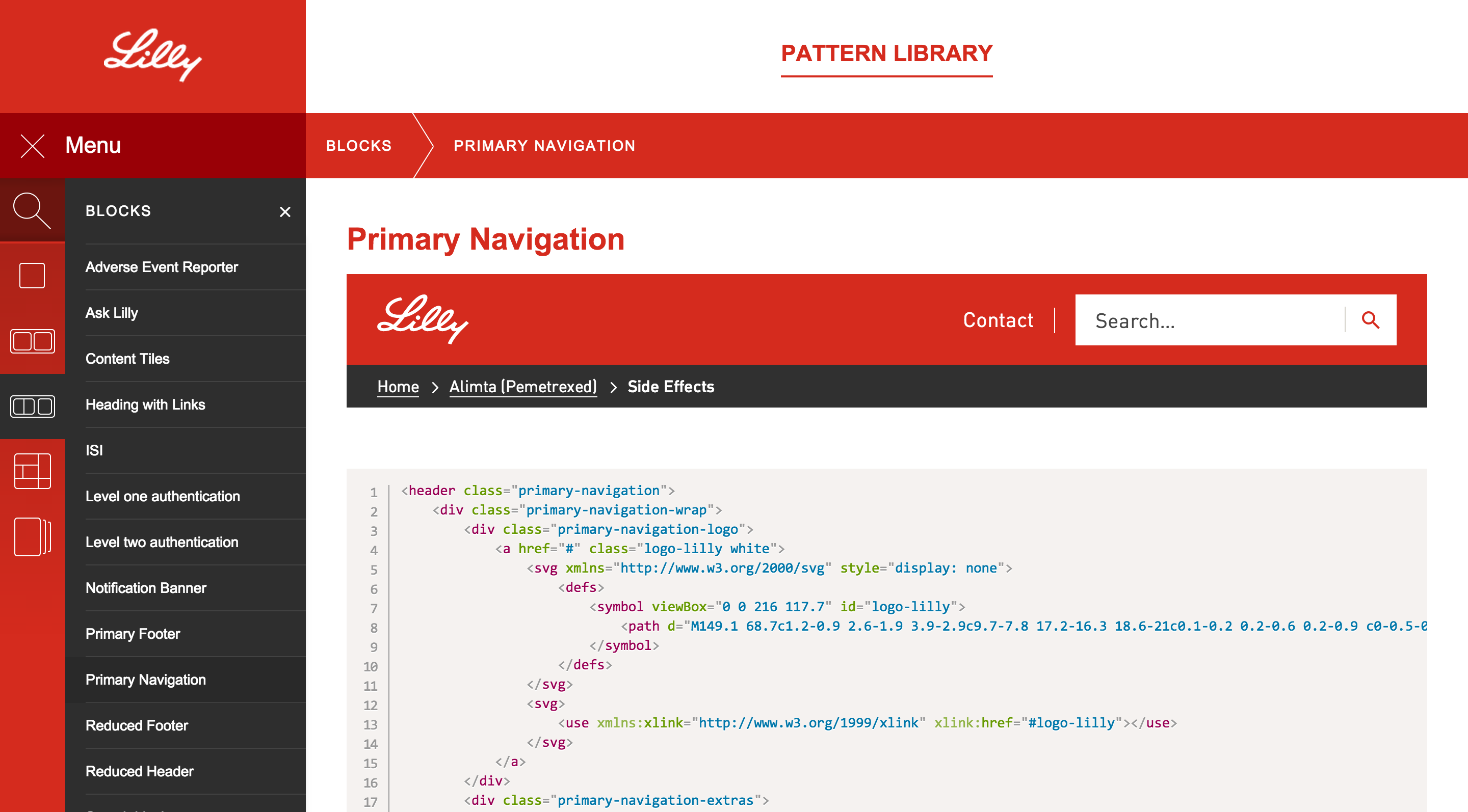
Atomic design pattern library.
As we were designing using a mobile first approach, initially for desktop we used same search button as for mobile, just a common magnifying glass icon.
However, users were missing the icon in research. When they wanted to search for something they weren't sure where to go. We hypothesised that this might be because they were looking for a white box which has a stronger affordance to search. Sure enough when we introduced this in a subsequent prototype users not longer had a problem locating search.
But we still had a problem. One of the reasons we had put search behind a button rather than just give the users a text box is that our search had to be scoped for legal reasons i.e. you had to choose the type of medication you wanted to search under before you typed in a search term.
One option we had around this was to display a white area that looked like a text box but was actually a button. However, we quickly discarded this idea as it felt misleading. What we did instead was put a border round the magnifying glass icon and add the word 'search'. This made it look more like a button and gave a hint of a text box. To users, this proved to be much clearer than just an icon alone.
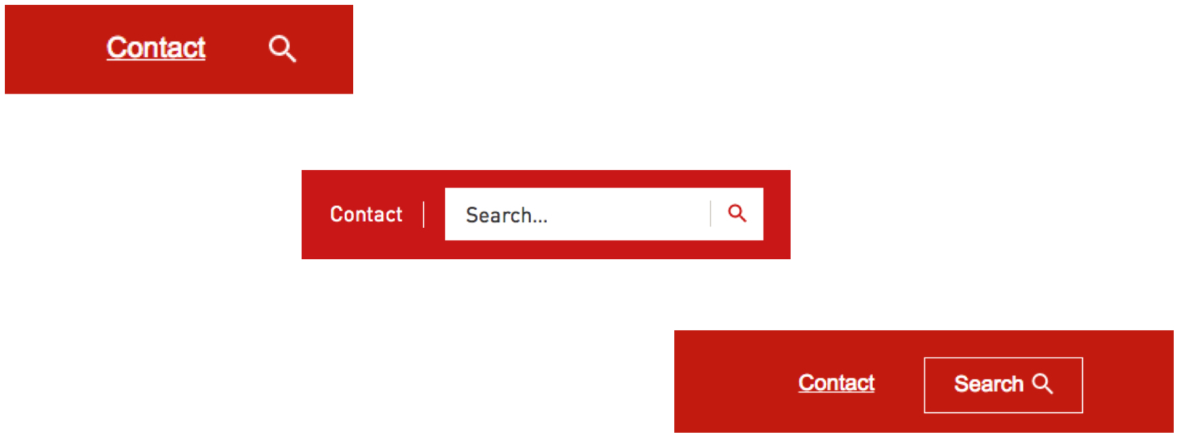
Evolutions of the search button.